

*This is what the finished header will look like on desktop*
This tutorial will teach you how to create a separate website header that drops in after scrolling down the page! No extra plugins necessary, however, Elementor Pro is required to create a header template and add custom CSS.
An amazing website header is often one of the overlooked aspects of web design. Your website header is one of the first things visitors see after landing on your site - and it can either make or break your website. Get it right and it will improve user experience (UX) and professionalism. Get it wrong and your website will look cheap, tank UX, and increase your bounce rate.
While trying to build a sticky header for a client site I ran into an issue - the white logo became invisible when the sticky header background color changed to white upon scrolling. So, I searched for a way to use Elementor's custom CSS to swap the logo for a black one when the sticky header became active - with no luck.
After posting the question on the Elementor Subreddit, r/elementor, u/jeremyfisher2 told me to check out ElementHow's tutorial on changing headers after scrolling. I was blown away by the header and needed to share it! So really quick before we start the tutorial, a quick shoutout to Maxime at elementHOW, and his tutorial for the inspiration and the code.
Check out the original elementHOW turotial here.
First, Create your Main Header
This is the header you want to show up normally when someone visits your website. If you have Elementor pro, you'll want to create this header in the theme builder as a header so it will show up across your entire website.
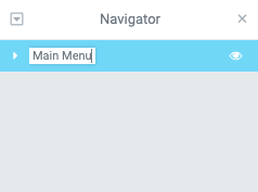
After creating the header, right-click on the section and enter the navigator where you can name it something to keep track of which header serves which function.
Second, Create your New Hop-in Header
This header can be anywhere on an individual page, or you can create it in the header template of the theme builder so it shows across the entire website. To create the header, add a new section.
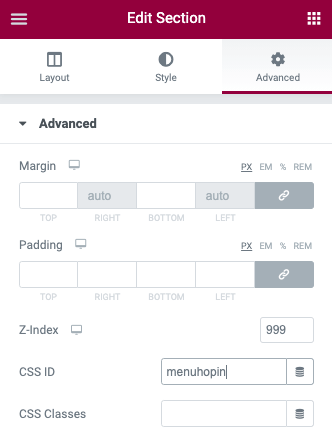
Third, Change the Section CSS ID and Z-Index
Edit the section and click on the advanced tab in the top right of the editor. Give the section a CSS ID of 'menuhopin' and a Z-index of 999.
You can give the section a different CSS ID, just make sure it matches with the CSS ID used to call the section in the HTML element code.
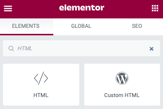
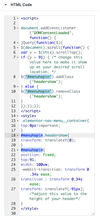
Fourth, Add the Code Below into an HTML Element
<script>
document.addEventListener('DOMContentLoaded', function() {
jQuery(function($){
$(document).scroll(function() {
var y = $(this).scrollTop();
if (y > 300) { /* change this value here to make it show up at your desired scroll location. */
$('#menuhopin').addClass('headershow');
} else {
$('#menuhopin').removeClass('headershow');
}
});});});
</script>
<style>
.elementor-nav-menu__container{
top:0px!important;
}
#menuhopin.headershow{
transform: translateY(0);
}
#menuhopin{
position: fixed;
top:0;
width: 100vw;
-webkit-transition: transform 0.34s ease;
transition : transform 0.34s ease;
transform: translateY(-110px); /*adjust this value to the height of your header*/
}
</style>
*I ran into issues trying to put the HTML element into the header, so I recommend adding the HTML element & code to the very bottom of your website footer, especially if you want the Hop-in header to activate on every page of the site.
Adjusting for Mobile Responsiveness
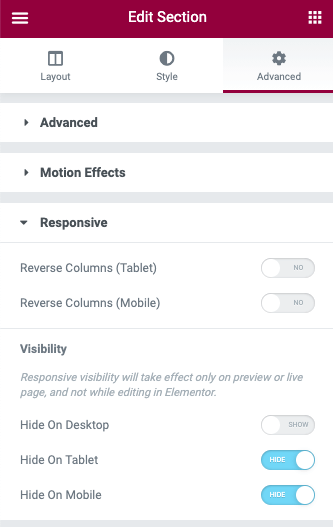
If you would like the header to only show up on a certain device (let's say you only want it to show up on desktop), simply edit the section, go to advanced tab > responsive > visibility, and turn off the visibility on tablet and mobile device.
If you have a separate header for the desktop and mobile version of the site, here is the process:
- Open the header template and footer template editors for your website
- If you don't already have one, build out the main header for the desktop version of the site, and a separate one for the mobile version. Name them accordingly in the navigator
- Create two separate hop-in headers - one for desktop, one for mobile. Name them accordingly in the navigator
- Give the desktop drop-in header a CSS ID of 'menuhopin', and a Z-index of 999
- Give the mobile drop-in header a CSS ID of 'menuhopin2', and a Z-index of 999
- In your website footer, add two HTML widgets - one for desktop, and one for mobile. Name them accordingly
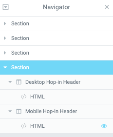
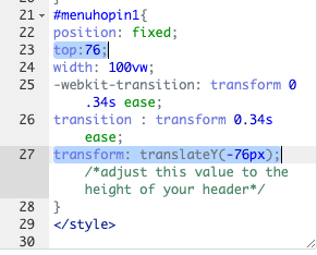
- In the HTML widget for the mobile hop-in header, edit the CSS ID in the code to match the CSS ID used in the mobile hop-in header, which is 'menuhopin2' in this instance. This needs to be edited in lines 8, 10, 18, and 21 of the HTML
- Open the HTML code and change the position that the hop-in menu will take by editing lines 23 and 27. You'll want to make the position match as closely as possible to the header sections. For my site, I did this by building the headers with a minimum height in pixels
- BOOM! Your header should work amazingly!
Conclusion
This custom header opens up the door for creating hop-in headers that activate as your visitors start scrolling down the page. The new hop-in header can have a different color logo, button, and navigation menu!
Thanks for reading!
Did you find this tutorial helpful? Will you be using this header on your website/client websites?